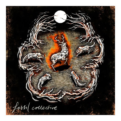
The t-shirt design for the band Vib Gyor's promotional push, coinciding with their debut album release has been finally signed off. The illustration itself, although remaining pretty constant since the original concept, has experienced quite a few style changes along the way.
The first quick conceptual sketch proved to be popular with the band and subsequent development kept pretty close to this version.
The first coloured version proved to be a little too colourful and bright, which was the result of looking to present something very bold, using the kind of colour palette that was reminiscent of 50's sci-fi comics and created an other worldly vibrancy . Didn't hit the spot though so changed the focus.
The third installment was originally used and posted on this site, but has since changed. Clear sharp vector illustration and the colours were subdued, choosing a tighter palette with more complementary colours and using halftone effects for all of the shading areas.
During conversations with Jonny Hooker from the band, the overall feeling was that something that had appealed a great deal when seeing the initial sketch had been lost, so lets try to take it back and get some of that rawness and spontinaeity back. So I traced back to the original and stayed clear of clean lines and pretty much stuck to lots of distressed brush effects in photoshop to get the final image. Starting off with the
white background helped a lot as the contrast levels in the image started quite high, and once the black background was introduced, these were tweaked and taken down a notch or two. The flash of light in the figures face was a last minute bit of experimenting, which is always worth doing as far as adjusting layer settings and maybe trying out some bold textures. It worked well and all of a sudden the image finds a new visual through it.


